Most small business owners have never heard of WCAG. They have definitely seen the symptoms: a visitor who cannot read grey text on white, a buyer who cannot tab to the checkout button, a screen reader user who hears "button button click here" with no context. Accessibility mistakes are UX mistakes, and on local service sites, they quietly cost calls and form fills.
1. Light grey text that fails contrast
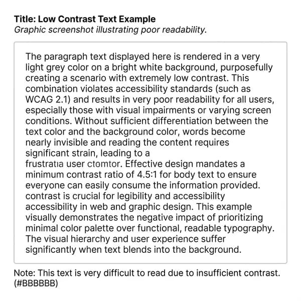
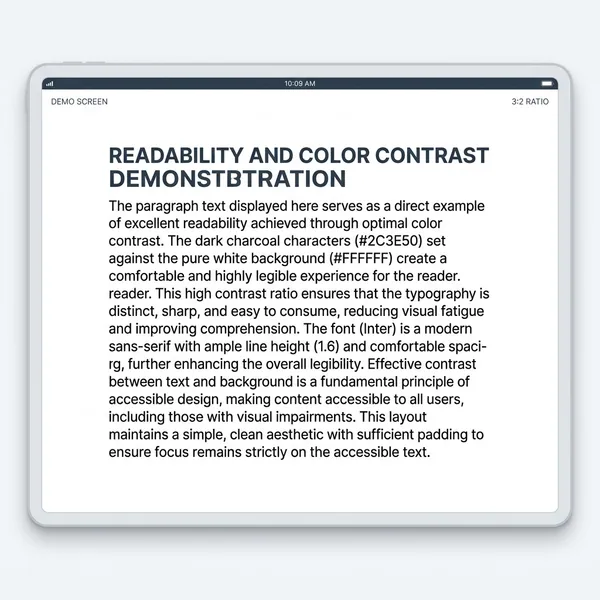
Design trends love soft grey body copy. Color contrast below WCAG AA (4.5:1 for normal text) is one of the fastest failures we see on audits, including ecommerce stores with disabled buttons nearly invisible on white. Fix: darken body text, thicken font weight, or lighten backgrounds. Test with a contrast checker, not your calibrated monitor.
2. Heading levels that skip (H2 to H4)
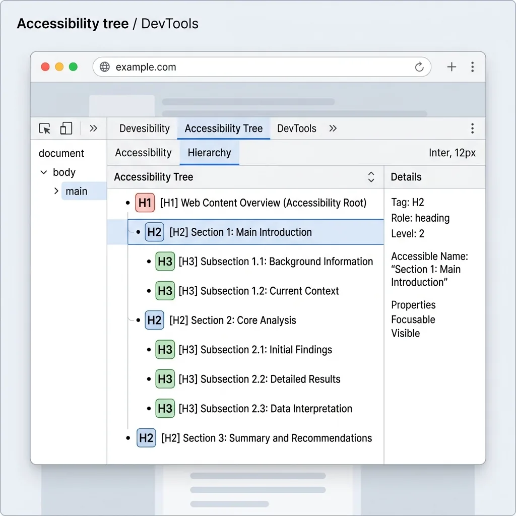
Screen readers use headings like a table of contents. Jumping from H2 to H4 because the visual style looked right breaks navigation. Fix: use headings for structure, CSS for size. One H1 per page, then nested H2 → H3 in order.
3. Images without useful alt text
Decorative images should have empty alt. Informative images need descriptions that say what matters, not "IMG_3842.jpg." Product photos need product names; team photos need names and roles if they support trust.
4. Forms you cannot complete with a keyboard
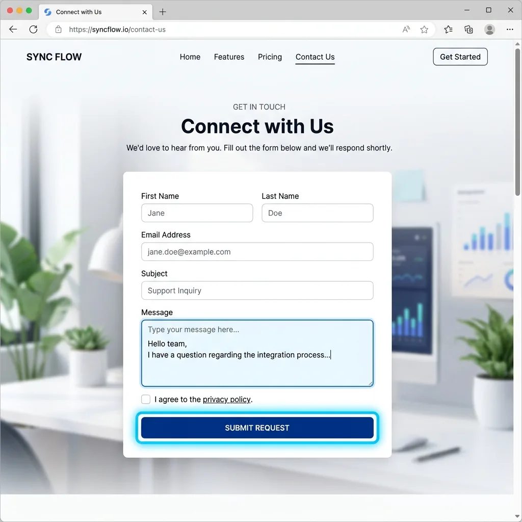
If Tab cannot reach every field, submit button, and error message, you have excluded keyboard only users and many mobile assistive setups. Visible focus rings matter too. Do not remove outlines without replacing them.
5. Icon-only buttons with no label
Hamburger menus, carousel arrows, and social icons need aria-label or visible text. A magnifying glass is not "Search" to a screen reader unless you say so.
6. Motion that ignores reduced motion preferences
Autoplay video, parallax, and scroll jacking can trigger vestibular issues. Respect prefers-reduced-motion in CSS and offer static fallbacks. Motion should enhance, not gate content.
7. Treating accessibility as a launch day afterthought
Bolting on an overlay widget after launch does not fix bad HTML. Build accessibility into design tokens, component libraries, and QA checklists. Run Lighthouse Accessibility on templates before content fills every page.
Accessibility repair on a live store is slower and pricier than getting contrast and headings right in the first comp.
From a BigCommerce rescue sprint
- Audit homepage, contact form, and primary conversion path first
- Fix contrast and heading order before chasing perfect scores
- Test one page with keyboard only navigation
- Add alt text when you add images, not in a panic later
- Formal ADA compliance reviews for regulated industries: scope separately
Growth and Scale builds with Supportlyweb include an accessibility review before launch. If your current site fails the basics above, a free discovery call will show you what to fix first, ranked by impact, not fear.
Sources
- Web Content Accessibility Guidelines (WCAG) 2.2W3C Web Accessibility Initiative
- Contrast CheckerWebAIM
- Accessibility audits in LighthouseChrome for Developers
- Understanding WCAG 2.2W3C
This article links to term definitions and credible external sources on our references page.
View references