Some clients come to you because they want to look modern. DeBrovys came to us with a different problem: they had already earned trust in the real world. Since 1885, they have manufactured industrial tarps in Louisville for truck operators, waste fleets, fabrication shops, and buyers who know exactly what they need and do not have time to wander.
Their catalog is not a boutique. It is 8,500 products deep. Fifty plus fabrics on the homepage. One hundred fifty plus referenced across About content. Ready to ship inventory sitting beside made to order custom work. Phone support, live chat, long FAQ pages that explain cut size versus finished size because buyers need education before they commit hundreds or thousands of dollars.
And yet when we opened debrovys.com for the first time, the story on screen did not match the company behind it.
Act I: The walkthrough that changed the project
Sheryl Rota's audit landed like a verdict. The store had data. It had history. It even had blog posts quietly dying in the footer. What it did not have was a reason to believe.
The hero said TARPS over a grey industrial photo and stopped there. The "since 1885" trust line, the kind of detail that should make a buyer exhale with relief, was buried where almost nobody would see it. Navigation dove six or seven levels deep. Featured products showed line drawings instead of guiding someone toward the right industry. Worst of all, products sat on the site showing $0.00 and $0.01 prices in public view, which is the ecommerce equivalent of leaving the loading dock lights off during a factory tour.
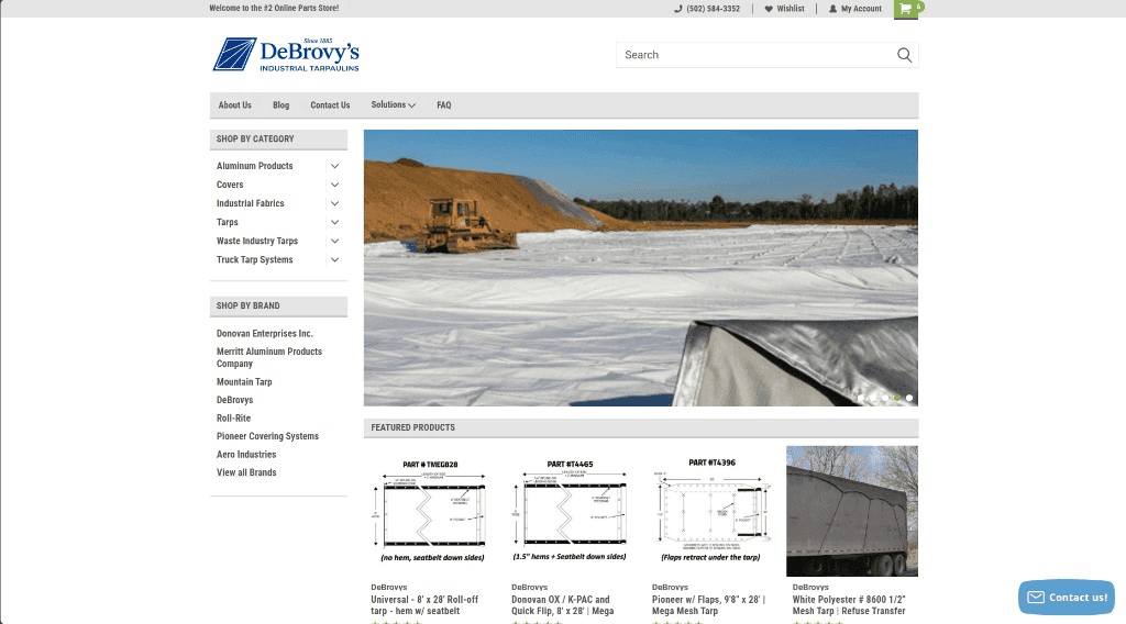
Industrial buyers need to find what they need in two clicks maximum. On the old site, it often felt like six or seven.
From the original DeBrovys design audit by Sheryl Rota
That line stayed with us. Because it named the real enemy. Not BigCommerce. Not the catalog size. Confusion.
Bruce and the stakeholders approved a new direction quickly once they saw it framed that way: deep navy for authority, industrial orange for action, off white instead of sterile white, charcoal text, a trust bar above the fold, industry entry points on the homepage, and a structure that said factory direct before it said browse 8,000 SKUs.
Act II: Fixing the plane while it was still flying
Here is the part most agencies skip in the retelling. We did not get to burn everything down on day one. The live Stencil storefront still had paying customers moving through it while the Next.js rebuild was being planned. So Phase 2 became a week of surgical repairs on a site that was already embarrassing the brand.
Guest checkout had to work and had to say so out loud. We changed the add to cart language to "Checkout as Guest" and fought a cached label in BigCommerce admin that refused to die in production. Stripe and PayPal were tested end to end in sandbox. Order confirmation emails were fired, caught, and verified. On mobile, product images were shrinking, disappearing, or loading inconsistently until the rendering logic was corrected.
Then came the accessibility pass, which sounds polite until you realize how many small failures were adding up. Light grey text failing contrast on white. Disabled buttons nearly invisible. Rating stars and carousel arrows fading into the background. Heading levels jumping from H2 to H4 like a staircase with missing steps. Screen readers were getting lost on pages that looked fine to everyone else.
We fixed the hierarchy page by page: homepage, category grids, cart, checkout, footer, account screens. And during a full mobile walkthrough from add to cart to order confirmation, three smaller villains appeared. A raw WebP CDN URL showing on product pages like a developer left the hood open. Product titles cut off mid word on narrow cards. And a Klaviyo floating bubble begging for email signups while blocking the very products people came to buy.
That flyout had generated zero revenue and two subscribers since launch. Two. We documented the removal and waited on client approval, because even obvious wins deserve a nod when they touch marketing tooling.
Act III: The rebuild, and the homepage that refused to load
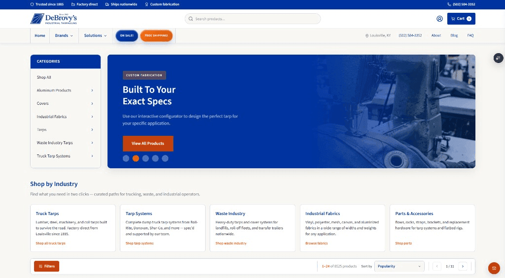
The headless rebuild on debrovys.vercel.app was the moment the brand finally looked like the operation. Trust bar. Industry cards. Hero sidebar that filters the catalog in one click. FAQ reorganized by real buyer questions. Partner logos normalized. Newsletter widget redesigned as a full viewport dialog instead of a popup ambush.
Visually, it worked. Then we hit the problem that almost made us look foolish in front of our own screenshots.
The first version of the Next.js homepage called loadFullCatalog(). That innocent sounding function pulled roughly 35 BigCommerce API pages, more than eight thousand products, and on a cold start it took about thirty seconds. Thirty. Visitors stared at "Loading catalog…" over a blank page while a company founded in the nineteenth century waited on a twenty first century spinner.
We probed the live production catalog on the June 13 session and confirmed the scale: 8,525 SKUs. Two hundred forty nine flagged on sale through MSRP heuristics. Four thousand five hundred forty eight eligible for a free shipping badge at $200 plus. Real numbers. Real business rules. And a frontend that had been trying to swallow the ocean on every visit.
What followed was not one heroic commit. It was a sequence of unglamorous saves. Disk caching with stale while revalidate. A preview cold start that fetched one API page instead of thirty five. Skeleton UI that made waiting feel intentional. Slim client payloads. Featured products limited to a single API call. tRPC wiring so the client stopped guessing. Router cache tuning so images did not reload when someone tapped back to Home. Deferred CSS on non homepage routes. Hero assets converted to WebP. A carousel experiment that cratered mobile performance to the mid fifties and got reverted the same day.
We learned that performance drama is often self inflicted. The winning version was not the cleverest. It was the stable one.
Act IV: The scoreboard
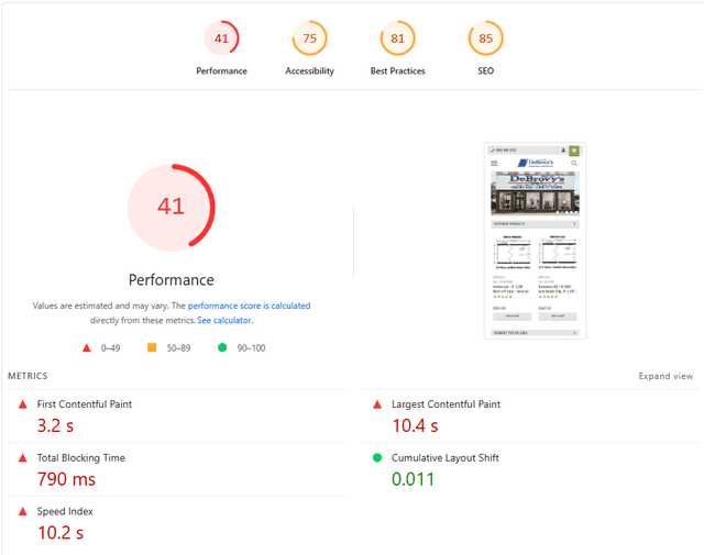
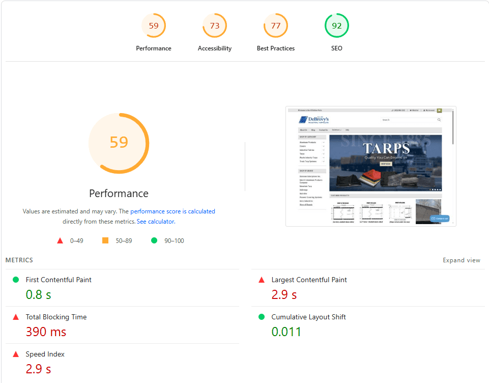
On the original BigCommerce site, mobile Lighthouse sat at 41. Desktop at 59. For a buyer standing on a job site with spotty signal, that is not slow. That is doubt.
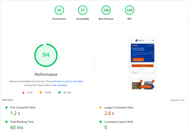
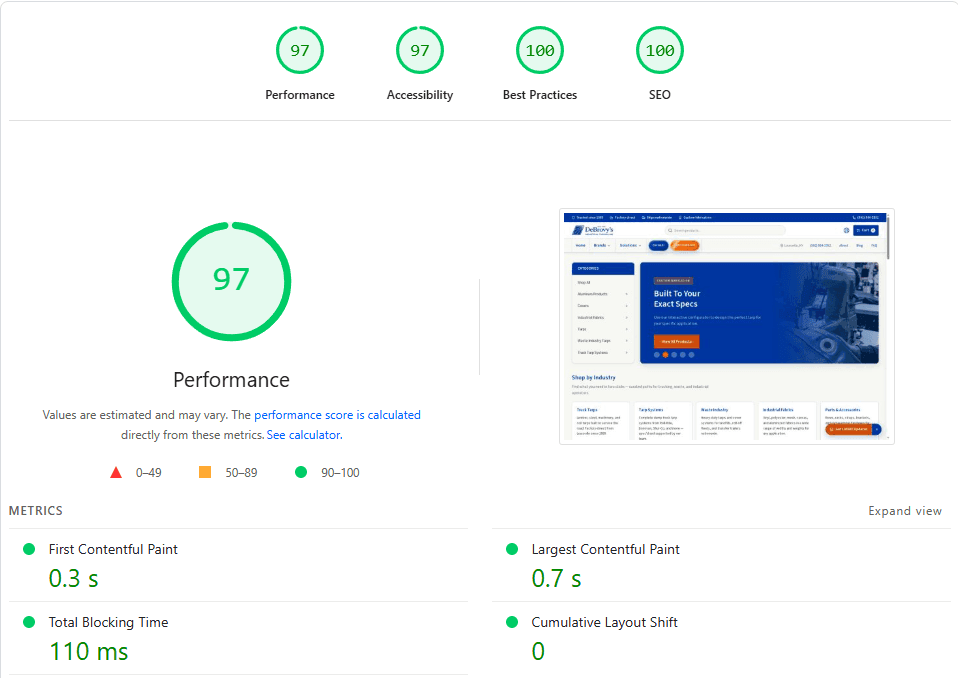
After the June 13 session performance and accessibility pass on the deployed preview, both mobile and desktop Performance and Accessibility climbed into the 94 plus range. Best Practices and SEO hit 100. The numbers were no longer a footnote in a weekly report. They were the plot twist.
Act V: What honesty looks like at handover
By Phase 4 we were no longer asking whether the storefront looked better. We were asking whether it would hold up when real traffic, real browsers, and real checkout pressure arrived. Cross browser QA ran through Chrome, Firefox, and Safari engines. Testimonials rendered. Klaviyo markers were present on the live HTML. Checkout paths were walked again and again.
And still, the documentation told the truth about what remained open: cart and checkout API scopes, checkout architecture choices, Klaviyo event wiring in Next.js, final client decisions on On Sale and Free Shipping definitions. A dramatic rebuild does not end with a confetti cannon. It ends with a clear list of what is done, what is proven, and what needs a decision from the people who own the business.
The rebuild was never a reskin. It was catalog engineering, accessibility repair, performance recovery, and a clearer path for buyers who already knew what they needed but could not find it fast enough.
Supportlyweb team reflection
Epilogue: what we would do again
If we took this project again tomorrow, we would still start by writing the business story before touching a template. We would still walk the live site like a buyer with a deadline. We would still separate Stencil rescue work from Next.js rebuild scope when both are happening at once. We would still treat an 8,500 SKU catalog like a performance problem on day one, not day thirty. And we would still capture Lighthouse before and after, because feelings lie and scores do not.
DeBrovys did not need a website that shouted. They needed one that finally matched the weight of the name behind it. The rebuilt experience is live at debrovys.vercel.app. If you want the full case study with demo video, deliverables, and every before and after capture, it is waiting on our portfolio.